Branding
OPUS

About OPUS
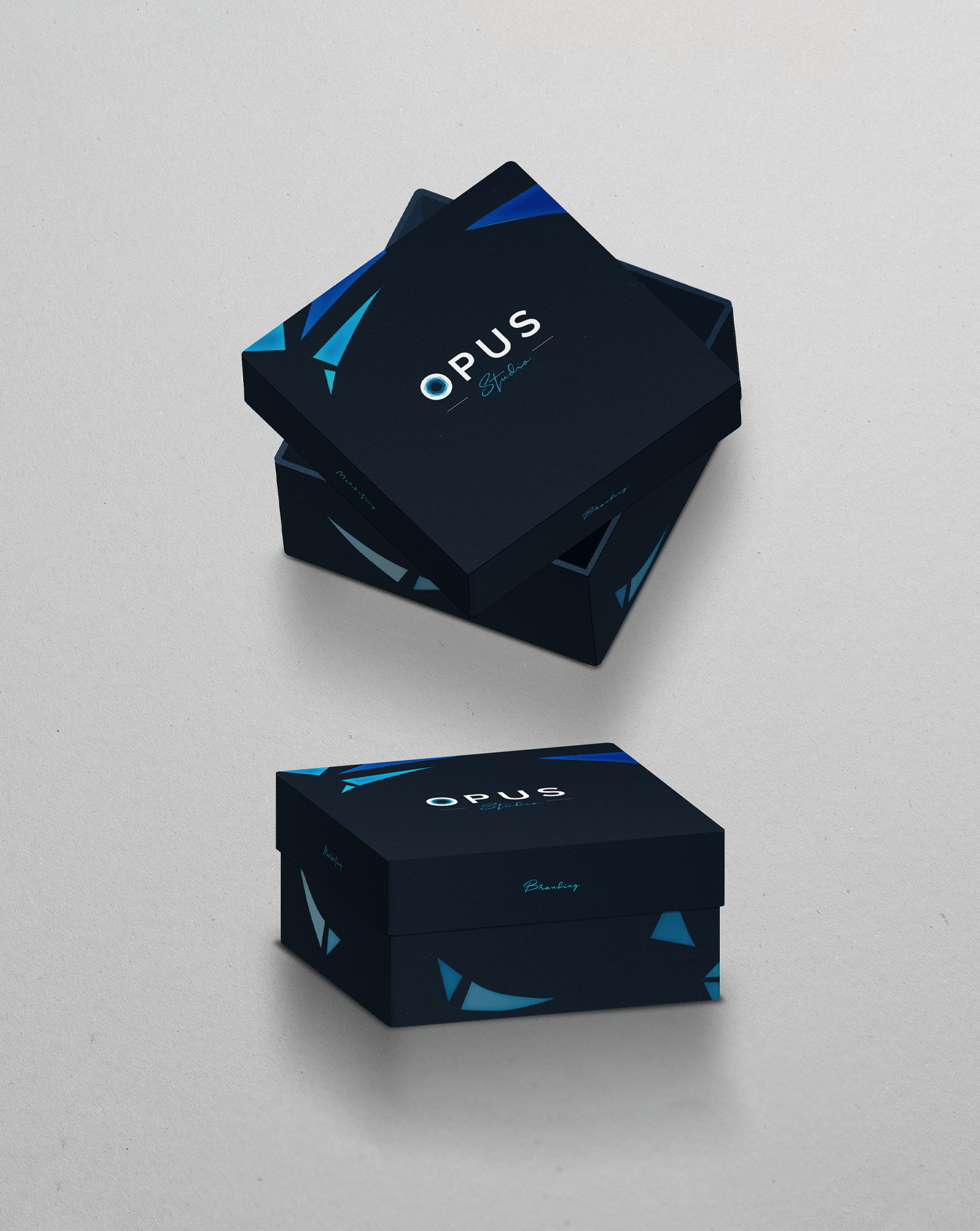
OPUS Studio works closely with international clients to develop effective branding and marketing strategies for their businesses.
001
Logo
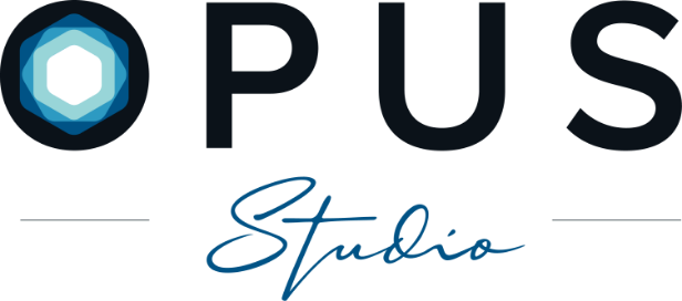
OPUS is known for creating bold, stylish, yet classic branding for their clients. Subtle symmetric geometries are embedded in the letter "O," showing the company's care for structured details.
The logo introduction demonstrates that the letter "O" is made of colorful particles. The dispersed particles symbolize the creative solutions that OPUS brings to their clients.
002
Color Palette
Light Blue
#98D5D8
Medium Blue
#2D9AC2
Dark Blue
#005386
Light Green
#A5BC6D
Light Orange
#EAB36A
Light Purple
#C4A8E2
003
Teaser Video
The branding services that OPUS provides are infused with features from a wide range of design disciplines, including graphic, UI/UX, product, and fashion design.
004
Icons
Research
Brainstorm
Strategy
UX/UI
Web Development
Product Visualzation
004
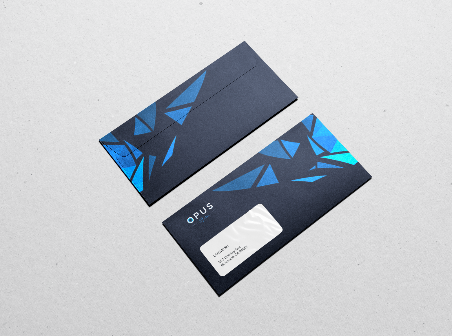
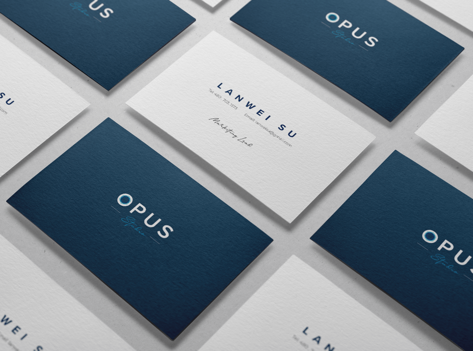
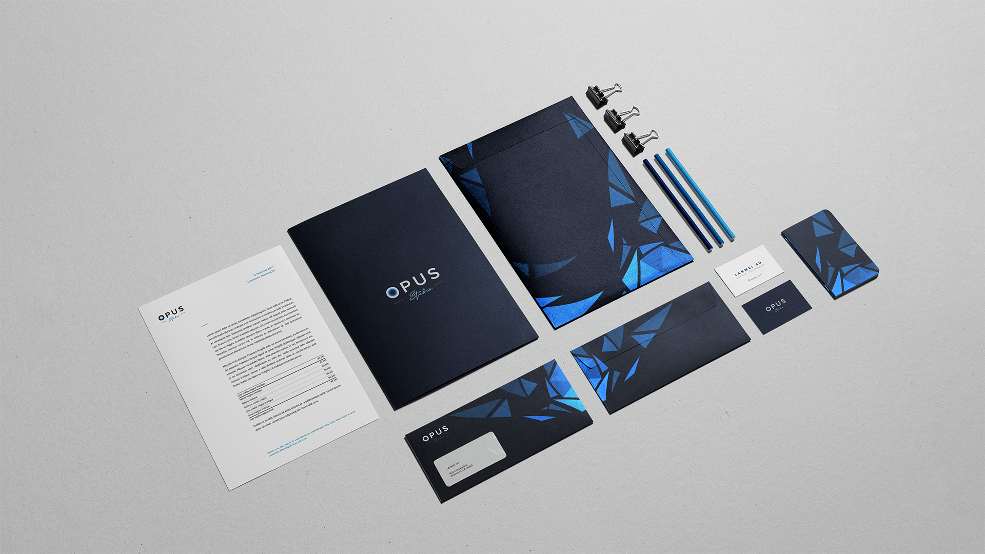
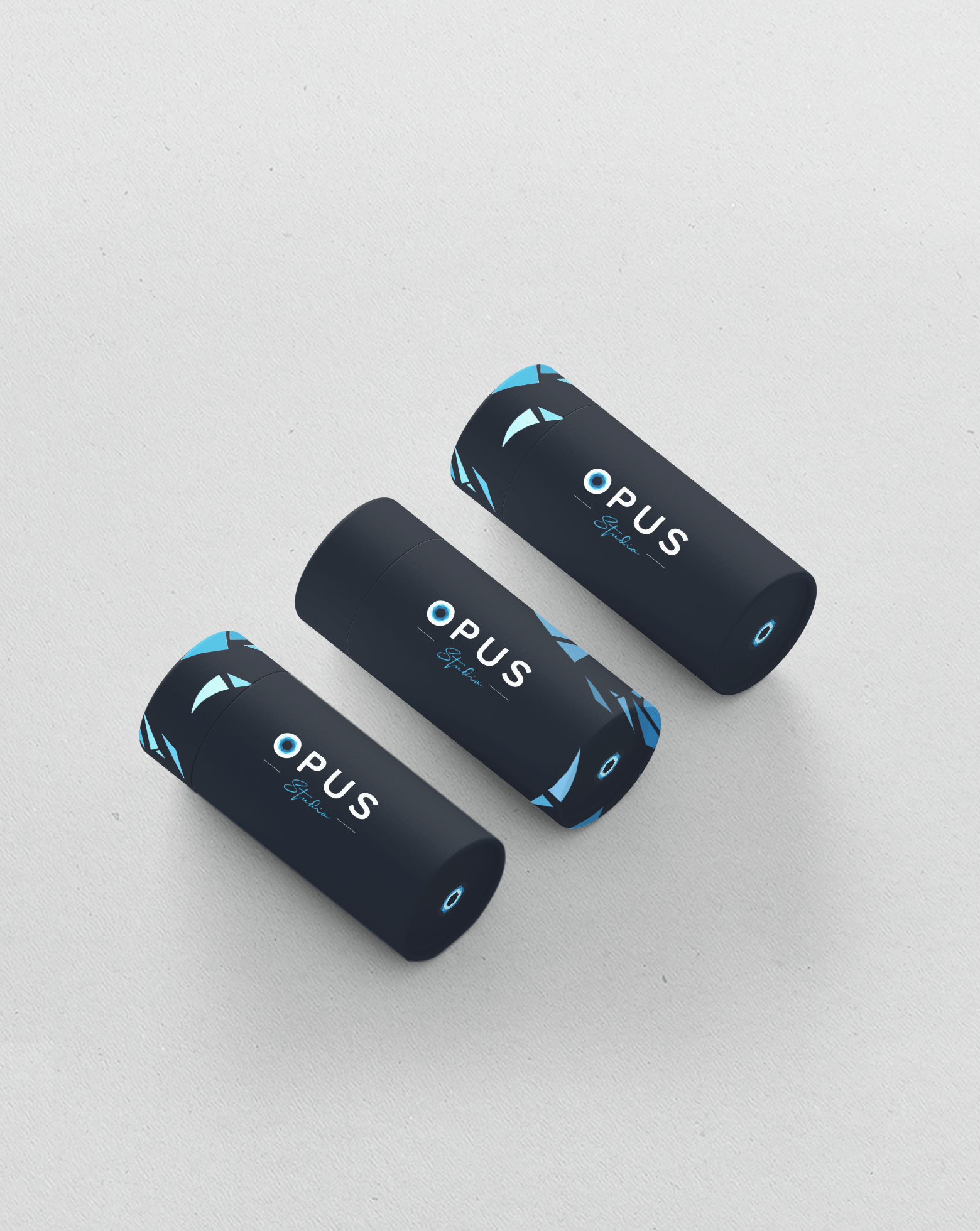
Applications
Client
OPUS Studio
Creative Director
Mahan Soltanzadeh
Design Director
Sheena Tu
Year
2020
